Apple Color is very much so an uphill climb. I am most certainly not the only colorist who believes it has one of the worst user interfaces of all time (save for maybe current Microsoft Office products). Color is:
- A horrible user interface.
- Pesky at best.
- Extremely powerful.
Yep, that number three is the very reason it deserves your time spent deep in the trenches of a learning curve. Color is not only extremely capable of fantastic color grading; it just seems to render its corrections well. I always feel like my footage comes out of Color looking better than when it went in, and not just because the color has changed. My intent here is not to give you a five star course on ALL the ins and outs of Apple’s Color software but to give you a great start so that you can leverage the power of this fantastic program.
I didn’t use Color forever because of its horrific interface. I used After Effects and its Color Finesse plugin and lights for major work. For minor work, I would just use FCP’s (Final Cut Pro 7) Three-Way Color Corrector filter and maybe some other filters like Tint and Color Balance along with that. Now, I always use Color. Here are some things to help you get there too:
Take your FCP timeline and go to <File><Send To><Color> and name your project. I’ve seen some instructors say that you have to flatten your video tracks down to track one; that’s FALSE. You definitely don’t have to do that. It could make your life easier in Color, but you don’t HAVE to do it. Color will recognize the separate tracks, and I’ll tell you how to see overlapping ones in just a moment.
Now, when Color opens up, you need to stop and consider something… something ridiculous. This is BY FAR the most ridiculous thing I’ve ever seen in a software program and the beginning of your user interface troubles. Even if you’re running dual monitors, Color opened up on just 1 of them. You can drag your windows, but you cannot resize the windows. This is a big problem since that tiny little preview window you see your video in is laughable at best when it comes to making fine color adjustments. To make that preview window bigger, you have to:
- Have a dual monitor setup, and if you do then…
- Go to <Window><Dual Display Mode>
Now, notice that nothing happened; that’s because you have to now <File><Quit> Color and then reopen it to activate the “Dual Display Mode” and Color will relaunch on both of your monitors. I warned you it was ridiculous… It doesn’t stop there.
If you’re like me and do not have the price of an LED backlit 46″ 240hz Samsung dream TV to drop on a second Apple 27″ monitor, you probably have one monitor that is better for color grading and one that is crappy or a different size. I have both cialisviagras.com. My second monitor is a freebie square 17″ with low resolution. Color has decided that my Preview window should be on the 17″ and my controls should be on the beautiful 24″ iMac screen. So, I drag the windows to swap them, except for the fact that since there are no resizing handles, the windows are stuck to the screen sizes they opened on! See what I mean?! At this point you’re pretty much stuck so, what you have is what you have.
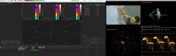
First thing’s first; double click your Preview directly on your video. This is how you toggle between a full window view or a view with your Scopes. Now, you’re ready to start color grading your clips.
I like to use my Primary In tab to balance the RGB spectrum of a clip using RGB Parade, but you don’t have to do this. Color grading is a very subjective art so, you may choose to not do this if you’re just wanting to have fun grading. For clients and for my own YouTube videos, I need consistently high quality results so, I always begin by balancing the clips and then using the Luma Curve to spread out my spectrum because the image from the camera is usually very flat (lacking contrast).
After I spend some time getting my clips balanced correctly, I move along to the Primary Out tab. This is where I make my color adjustments according to what is required for the mood of the scene or what looks best to me. Like cooking, it’s a choice of flavor, and there is rarely a right or wrong to it. You do, of course, want to avoid adding noise or compression banding to your scene, but again, sometimes it might be better to opt for greater luminance, despite a resulting noise introduction. It’s all really up to you (or your client), and that’s what I love about color grading!
Now, that you’ve sprinkled some color changes into your Shadows, Midtones, and Highlights move along to the Secondaries tab. The first thing I will say here is “EASY DOES IT!” Mess around with your Hue and Saturation curves for a minute, and you’ll see that a partial adjustment is actually a very big adjustment (click the little diamond at the left of any control in Color to reset that control). Take small steps in the Secondaries room but use it to adjust the overall look of your scenes. As far as the Hue curve goes, do whatever you think is best for your video. As far as the Saturation curve goes, I actually prefer to use the Primary Out tab’s Saturation controls FIRST, then I go to the Saturation curve in the Secondaries room to dial up or down certain colors in the scene, and FINALLY I go back to the Primary Out tab to make a final adjustment.
The other “rooms” in Color like the Color FX tab and the Geometry tab will have to have their very own text tutorials because they can both get quite complicated (Motion Tracking, Custom Shapes, Nodes, etc.). For now, just practice the things I’ve mentioned here, and you’ll start getting happier with Color. When you are done with your project, just go to the Render tab and click <Add All> and then <Start Render>. Once Color has finished rendering, go to <File><Send To><Final Cut Pro> and you’re done! Just go to the Project window of FCP and double click the sequence that Color put there to open up your fully graded project.
I hope this helped some of you get over some of the nastiness of Apple Color and its woes. It definitely has some bad points and frustrating ticks, but I really believe that its resulting image capabilities outweigh its frustrations. One day, I plan to replace Apple Color with Davinci Resolve, but until that day comes, Apple Color is my color grading weapon of choice.